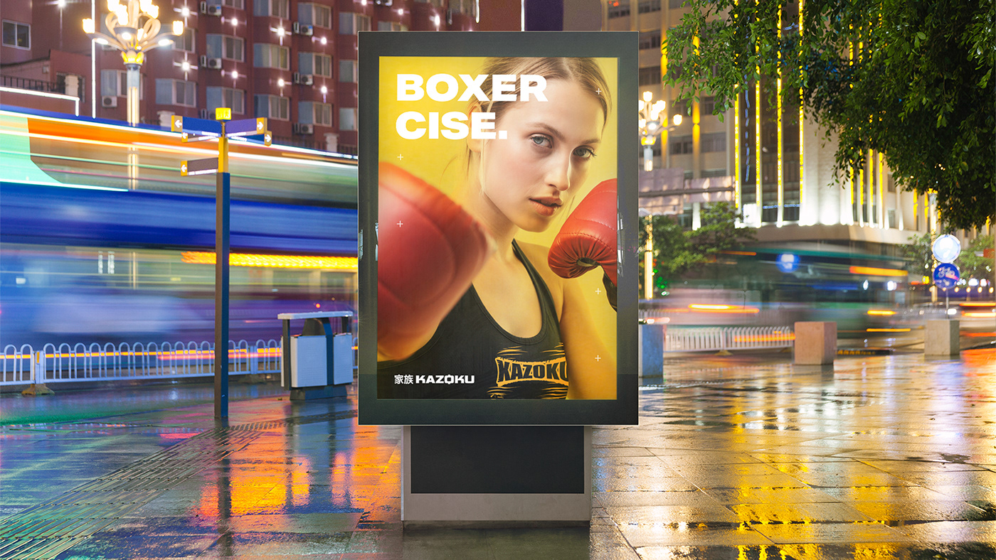
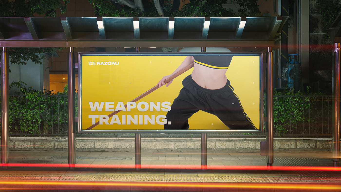
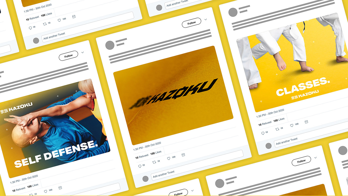
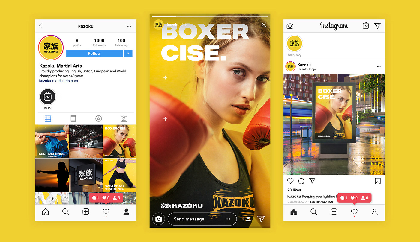
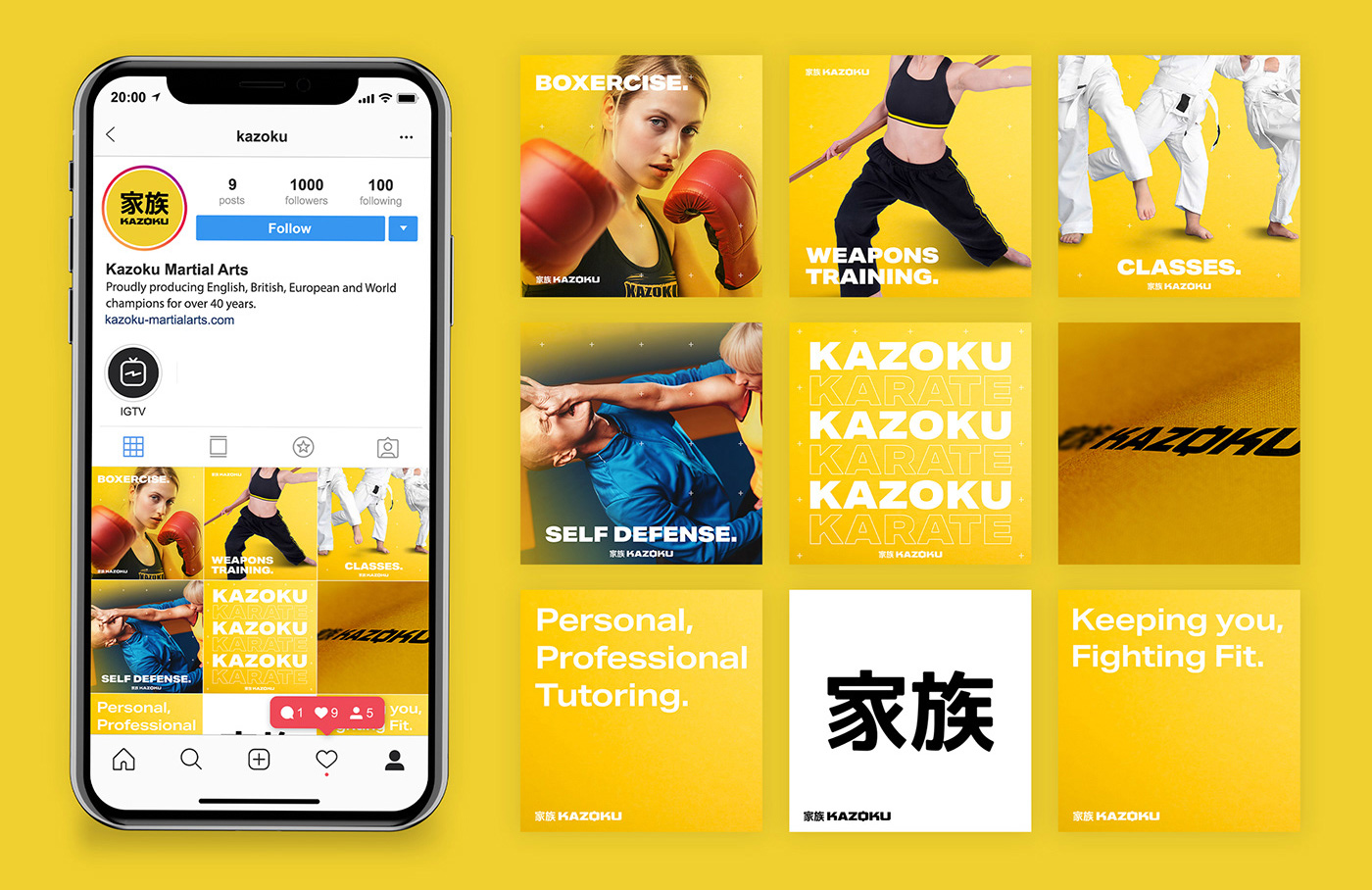
The project:Create an attractive rebranding for Kazoku Martial Arts. Designing concepts, ads and social posts to be used across social channels. Alongside developing their new website.
Kazoku Martial Arts has been proudly producing English, British, European and World champions for over 40 years. Kazoku Martial Arts was opened in Rotherham in 1974 by Sensei Ian McAllister, with his full time Dojo residing on Badsley Moor Lane for over 30 years, before retiring from Martial Arts in 2004. The Kazoku mission is now continued by Daughter and English, British, European and World Title holder Ellen McAllister with support from the Kazoku Team.
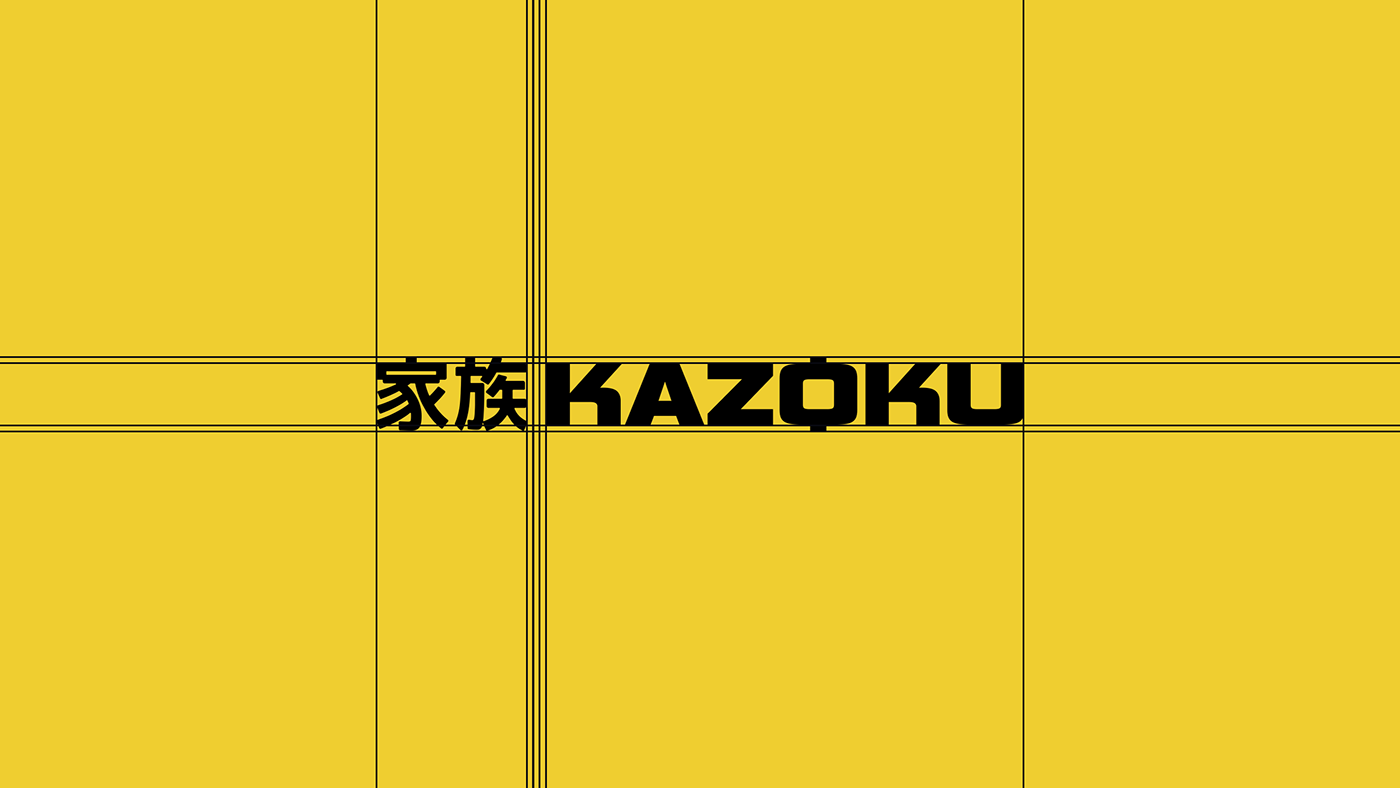
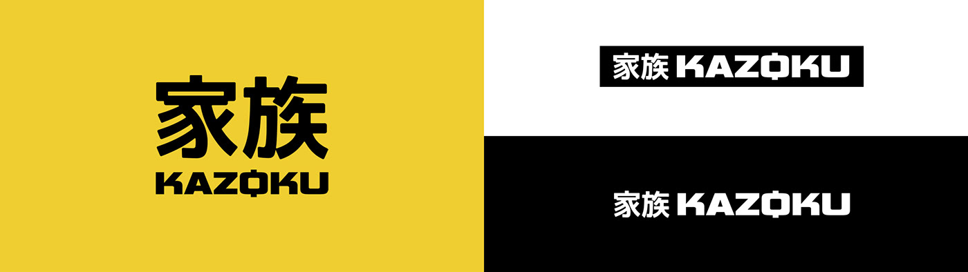
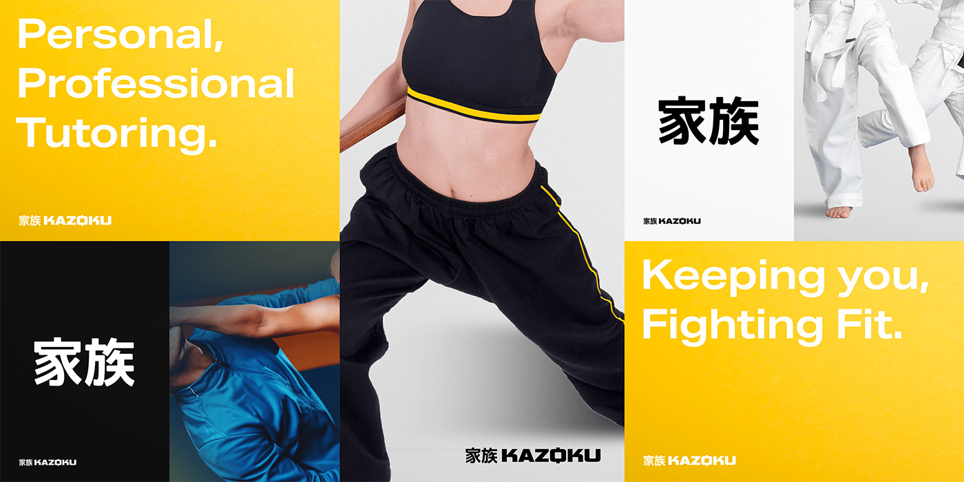
The Logo, Palette and Font — We modernised Kazoku’s previous logo which they had used for the last 40 years. Proposing a bold, strong logotype, paired with an equally prominent Japanese logotype, meaning Kazoku. Kazoku, the English translation of which is- family: with the club now being continued by Sensei Ian McAllister’s daughter Ellen McAllister, the strength of the clubs family values of inclusivity and loyalty further reinforced.
The colour palette was selected focusing on a vibrant yellow, a deep black and clean white. Yellow was selected to move away from tradition, a traditional colour used in Japanese culture being red. The moving away from tradition represented by Kazoku’s freestyle karate classes, and additional non-karate classes. Yellow represents positivity, clarity, enlightenment, honour and loyalty, these representations a testament to Kazoku’s teachings and values.
If you would like to know more about Kazoku, visit their website.
This website uses cookies to improve your experience. We'll assume you're ok with this, but you can opt-out if you wish. Cookie settingsACCEPT
Privacy & Cookies Policy
Privacy Overview
This website uses cookies to improve your experience while you navigate through the website. Out of these cookies, the cookies that are categorized as necessary are stored on your browser as they are essential for the working of basic functionalities of the website. We also use third-party cookies that help us analyze and understand how you use this website. These cookies will be stored in your browser only with your consent. You also have the option to opt-out of these cookies. But opting out of some of these cookies may have an effect on your browsing experience.
Necessary cookies are absolutely essential for the website to function properly. This category only includes cookies that ensures basic functionalities and security features of the website. These cookies do not store any personal information.
Any cookies that may not be particularly necessary for the website to function and is used specifically to collect user personal data via analytics, ads, other embedded contents are termed as non-necessary cookies. It is mandatory to procure user consent prior to running these cookies on your website.